COUNTIES WITH HIGH COVID-19 RISK: SET #1
Zooming in: counties with high poverty rate
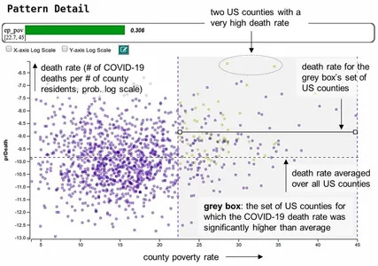
In the visualization on the left, each data point is a county and the placement along the horizontal axis is determined by its poverty rate. The vertical axis is the COVID-19 death rate.
The grey box contains the counties where on average and compared to other US counties an unusually high number of residents died from COVID-19, in relation to the county’s overall population. Due to its importance we shall call it the Box of High Risk.
We can observe the high risk since the points in the box tend to float in higher regions, which defines higher COVID-19 death rates. The placement of the box tells us that high poverty rate (>22.5%) is common for these counties.
However, that’s not the full story: We see that the grey box has a mix of purple and yellow points; but only the yellow points are counties where high COVID-19 death rate is consistent. The green Bar of Confidence on top of the plot is about 30% of the full length and the number next to it reads 0.306 accordingly.
This means that our risk assessment is still about 70% off. Not all counties with higher poverty rate are at higher than usual risk of COVID-19 death. We need to refine the pattern.
But we are on the right track: We do observe that there are only purple dots outside the grey box. That’s reassuring since it proves that our pattern mining engine did not overlook any county that is of interest for this specific pattern description (the yellow dots).
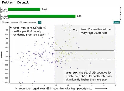
Zooming further: poor counties with an aging population
Our pattern mining engine automatically refines the pattern description by adding “age greater than 65” as a second feature. This constraint is added only to the counties that were in the initial Box of High Risk. That is why there are fewer counties in this visualization now.
It sharpens our risk assessment to counties with higher poverty rates and aging population. Fittingly, the green Bar of Confidence now reads 64%. We are getting better but we still have more work to do to reach 100% — there are still some purple dots.
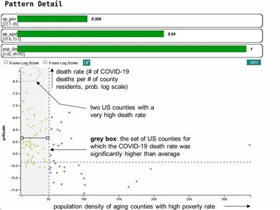
The final cut: poor, aging, rural counties
The third automatic pattern refinement step leads to the final visualization on the left. The grey-boxed counties from above are now ordered from the aspect of population density. The placement of the new grey box tells us that it is the counties with low population density which on average have a COVID-19 death rate above US average.
There are no more purple points in the grey box which means that our risk assessment is razor sharp. The bottom-most green Bar of Confidence confirms this; it’s maxed out at 100%.
Final takeaways
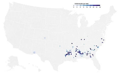
What we learn from this pattern is that poor and aging counties with low population density are on average especially hard hit by the COVID-19 virus. While it is well known by now that older residents are more vulnerable to COVID-19, the pattern tells us that this high risk seems to be amplified by two factors:
(1) the residents live in sparsely populated areas which offer fewer urgent care facilities and
(2) the residents are mostly poor which hampers their ability to use and pay for these services.
So if you live in such a county (see map on the left) you now know that there are risk factors that make you more susceptible to COVID-19. While we offered some speculations on why these factors may amount to a higher COVID-19 death rate, more research is needed to be sure.
As such, we view the insights we gathered in our analysis not the end, but rather a beginning. They need to drive more studies and new policies in health care.